A behind-the-scenes look at how I used hierarchy, color contrast, and layered typography in Illustrator and Photoshop to build a cohesive brand experience across print, social, and billboard formats.
When I began designing the “Sweet Treats” campaign, I wanted the visuals to reflect the emotional promise behind the tagline: Every Bite is an Occasion.
The goal was not only to advertise desserts, but to position them as meaningful parts of life’s celebrations. Drawing on principles from our course readings like visual hierarchy, contrast, alignment, repetition, and purposeful typography, I built a cohesive campaign spanning print, social, and billboard formats.
Establishing Purpose and Visual Hierarchy
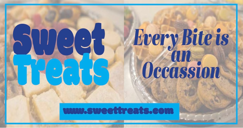
The first design decision centered on hierarchy. In multiple layouts (see page 1 and page 4), the phrase Every Bite is an Occasion functions as the primary focal point. I used scale and typographic contrast to guide the viewer’s eye from the brand name, to the tagline, to the supporting copy, and finally to the call to action.
The large, bold “Sweet Treats” establishes immediate brand recognition. Beneath or beside it, the serif tagline introduces sophistication and emotional tone. Supporting paragraphs are set in smaller, readable text blocks to maintain clarity and organization. The structure reflects information design, where viewers can process the message quickly without feeling overwhelmed.
I also applied alignment and repetition consistently. The bright blue border frames every format to create visual unity across platforms. This repetition helps with brand cohesion and reinforces recognition regardless of medium.
Color, Contrast, and Emotional Tone
Color plays a central role in communicating purpose. I chose a vibrant blue palette to contrast against the dessert photography. Based on design theory, contrast increases readability and visual impact. I chose cool-toned typography that stands out clearly against the softened, slightly muted background imagery.
To prevent visual competition between text and photography, I reduced the opacity of the background images in Photoshop. I added a white overlay layer set to a lower opacity to soften the desserts without losing detail. This technique allowed bold typography to remain legible while preserving the appeal of the food imagery.
The color repetition in the headline, call-to-action buttons, and borders reinforces consistency while guiding attention. For example, the “Book Your Celebration Now” banner appears in a solid blue rectangle, creating a strong contrast block that immediately signals action.
Creating Bold, Impactful Typography in Illustrator
Typography is the most expressive element of this campaign. In Illustrator, I created bold, layered text treatments to amplify impact. For the “Sweet Treats” logo-style headline, I:
- Adjusted kerning manually to improve spacing and balance.
- Used the Pathfinder tool to refine shapes and smooth curves where necessary.
- Applied two contrasting fills (deep blue and bright aqua) to create variation.
For the tagline “Every Bite is an Occasion,” I chose a high-contrast serif typeface for its elegance. I increased leading slightly to create spacing and adjusted tracking to improve readability at large scale. In some layouts (such as page 2), I staggered the line breaks intentionally to create rhythm and vertical movement, reinforcing the celebratory tone.
Assembling Photoshop and Illustrator Assets
The workflow required integration between Photoshop and Illustrator. I edited all photography in Photoshop first, adjusting brightness, contrast, and saturation for consistency. I used adjustment layers (Levels and Color Balance) to ensure the desserts appeared warm and inviting without overpowering the layout.
After preparing the images, I placed them into Illustrator using File → Place and embedded them to maintain file integrity. Working in Illustrator allowed me to:
- Build scalable vector typography for crisp reproduction across formats.
- Maintain consistent artboard sizes for Facebook (1200 x 630), Instagram (1080 x 1080), and billboard layouts.
- Align text and shapes precisely using Smart Guides and the Align panel.
I also used layers strategically, separating background imagery, text elements, borders, and call-to-action buttons. This organization made revisions efficient and ensured consistency across all deliverables.
Designing for Multiple Platforms
A strong design adapts across formats while maintaining purpose. The Facebook and Instagram versions retain the core hierarchy but adjust scale and spacing for platform-specific viewing behavior. The billboard mockup (page 7) simplifies supporting text to ensure legibility at distance.
By preserving the central message and visual identity while adapting layout structure, the campaign achieves both flexibility and cohesion.
This project demonstrates how application of hierarchy, contrast, repetition, alignment, and typographic intention can transform an advertisement into a cohesive visual narrative. Through deliberate color choices, layered typography in Illustrator, and carefully edited Photoshop imagery, I created a campaign that communicates celebration, elegance, and warmth.
Ultimately, the design supports the brand promise: dessert is not just dessert, it is the final impression, the photographed detail, and the bite guests remember long after the celebration ends. Every bite truly is an occasion.

Leave a comment