This post walks through my design process from draft to final, highlighting how peer feedback, layout refinements, and mobile-first thinking strengthened the overall campaign.
When I created my Draft Graphic Design Project for the Shaw Center for the Arts Grand Opening, my initial goal involved developing a cohesive set of visually appealing marketing assets that worked across print or digital. After reviewing the peer feedback and revisiting my own decisions, I refined the project into stronger, more intentional campaign assets, with my goal expanding to include clarity, consistency, and mobile-first readability.
This post walks through my design process from draft to final, highlighting how peer feedback, layout refinements, and mobile-first thinking strengthened the overall campaign.
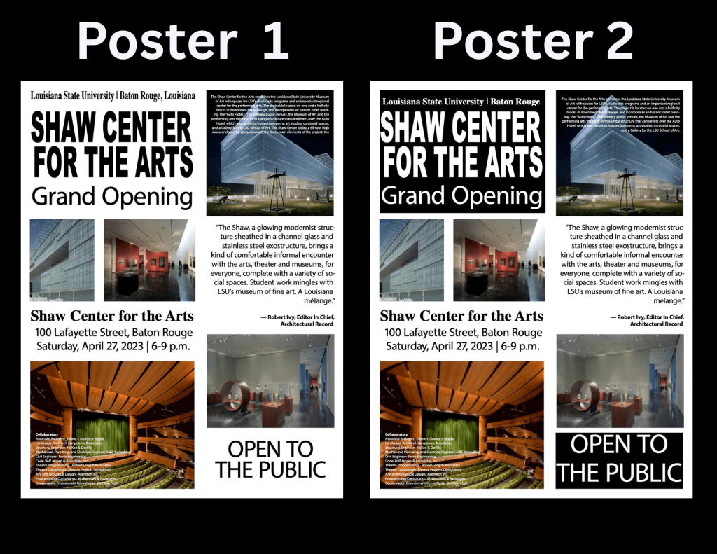
Print Invitation
For the draft project, the print invitation served as the foundation for the entire campaign. Because this was a grand opening and open to the public,I wanted the invitation to feel elevated while remaining approachable and easy to read.
I used a black background to create strong contrast and allow the typography to stand out. The headline font is bold and condensed to anchor the layout, while supporting information such as the date, time, and location was set in a more readable serif typeface.
Peer feedback reinforced that the poster was one of the strongest pieces in the project. Madison specifically noted that the invitation was especially aesthetically pleasing and that the dark background helped everything pop. Based on Rebecca’s suggestion, I added “Open to the Public” to the invitation in the final version to immediately clarify accessibility and remove any ambiguity for viewers.
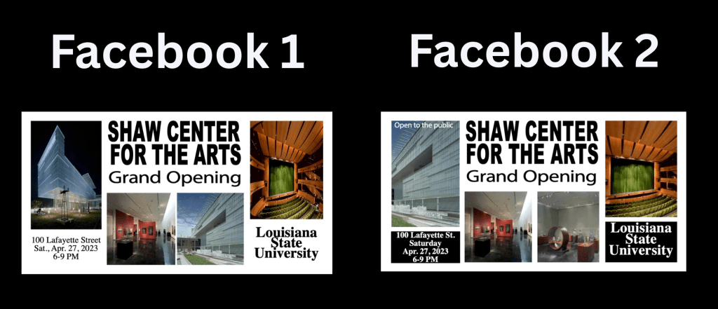
Facebook Post
The Facebook post was designed with fast scanning in mind, knowing that users would likely encounter it while scrolling on their phones. In the draft version, I incorporated multiple images to showcase the Shaw Center’s architecture and interior spaces, along with layered text to communicate key details quickly.
Peer feedback pointed out a few areas for improvement. Michael said that some images appeared stretched rather than cropped, which slightly detracted from the overall polish. In response, I adjusted image placement and ensured all photos were properly cropped to maintain their proportions.
I also increased line spacing for “Louisiana State University,” a change suggested by both Rebecca and Michael, which improved readability and gave the text more breathing room, which Rebecca noted is important for mobile readers.
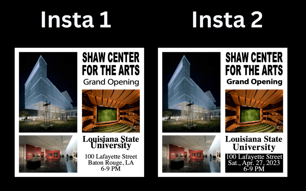
Instagram Ad
Because Instagram is highly visual and overwhelmingly mobile-first, this asset required the most restraint. In the draft version, I focused on strong hierarchy and minimal copy so the message could be understood at a glance.
Peer feedback highlighted that the overall layout worked well for mobile, but the leading on “Louisiana State University” felt tight. For the final version, I increased line spacing and adjusted alignment so the text felt less compressed and easier to read on smaller screens. I hope that the subtle changes made the design feel more balanced and helped reinforce consistency across platforms.
Print Invitation
From the start, I wanted it to reflect the Shaw Center’s modern architecture while remaining clear and easy to read. I used a black background to create strong contrast, coupled with a bold and condensed headline and a serif typeface for supporting details like the date, time, and location.
Peer feedback confirmed that this asset was visually strong overall. Madison noted that the invitation was especially aesthetically pleasing and that the dark background made the content pop. Based on Rebecca’s suggestion, I added “Open to the Public” in the final version to immediately clarify accessibility. This small but intentional change improved message clarity without disrupting the visual hierarchy or overall design.

Supporting Social Media Copy
In both the draft and final versions, I treated the social media copy as an extension of the visual design rather than secondary. The captions were written to reinforce the event’s significance while remaining clear, concise, and accessible to a general audience.
The Shaw Center for the Arts officially opens its doors! Experience world-class art, performance, and design at LSU’s newest cultural landmark. Join us Sat., Apr. 27, 2023 | 100 Lafayette Street | 6–9 PM
Rebecca specifically mentioned that the blog post effectively explained why design and messaging decisions were made, noting that the writing reflected a strong PR background. This reinforced my decision to keep the copy informative without being overly promotional.
Technical Execution in Adobe InDesign
All assets were revised and finalized in Adobe InDesign. I relied heavily on paragraph and character styles to make typographic adjustments efficient and consistent across formats. This allowed me to refine spacing, hierarchy, and alignment without manually editing each text box.
Grid systems and guides were used to standardize margins and spacing, ensuring that each asset felt like part of a cohesive system. Master pages helped maintain consistent placement of recurring elements such as the event title and university name, especially when exporting assets for different platforms.
This revision process reinforced how small adjustments, like spacing, alignment, and clarity, can improve the effectiveness of a design. The peer feedback confirmed that my overall concept was strong, while helping me identify areas for refinement to enhance readability and cohesion.

Leave a comment