a grand opening poster, invitation, and social media ads—plus my Adobe InDesign process and design rationale
Designing for an event means solving two challenges at once: communicating essential information clearly and getting people to show up.
For this draft project, I wanted each piece to work on its own, but also feel like part of the same visual family across formats and audiences. Across all assets, I prioritized readable type, a predictable information order (what / where / when). I also used a balanced layout that feels arts-focused but still accessible to a general audience.
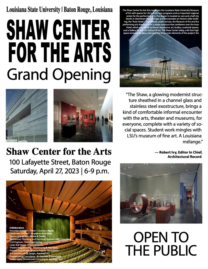
Poster
The poster is the most information-dense, so the design challenge was managing hierarchy and chunking without overwhelming the reader. I included all provided copywriting while still highlighting the essential event info: “Grand Opening,” “Shaw Center for the Arts,” “Open to the Public,” and the date/time/location. To keep the layout scannable, I relied on contrast and alignment to create clean reading paths, and placed the event details where the eye naturally settles after reading the headline content.
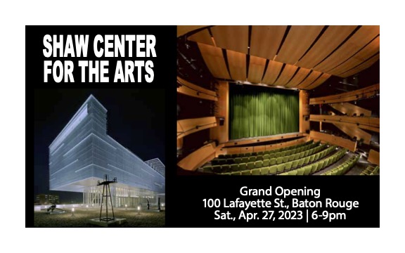
Invitation
The invitation is a smaller printed piece, so it required a tighter message and a more refined, “keepsake” feel. The main design decision here was reducing information to only what the audience needs to attend: the venue name, event title, address, and date/time. In terms of design language, I kept the typography and spacing consistent with the system, using repetition of key phrases to strengthen recognition across the set. I also leaned on white space as an active design element, giving the text room to breathe so the invitation feels intentional rather than crowded.
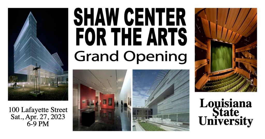
The Facebook asset needed a design for quick comprehension in a busy feed. Here, I emphasized the most share-worthy essentials: event name, “Grand Opening,” and the date/time. Because Facebook posts are often seen at mid-size on mobile, I prioritized legibility and simplified the layout so that the message will survive scrolling. I also considered platform context: Facebook is more likely to be used for planning and sharing events, so I kept the content high-level (including “Louisiana State University” and the address) while still maintaining the same typographic hierarchy as the print pieces.
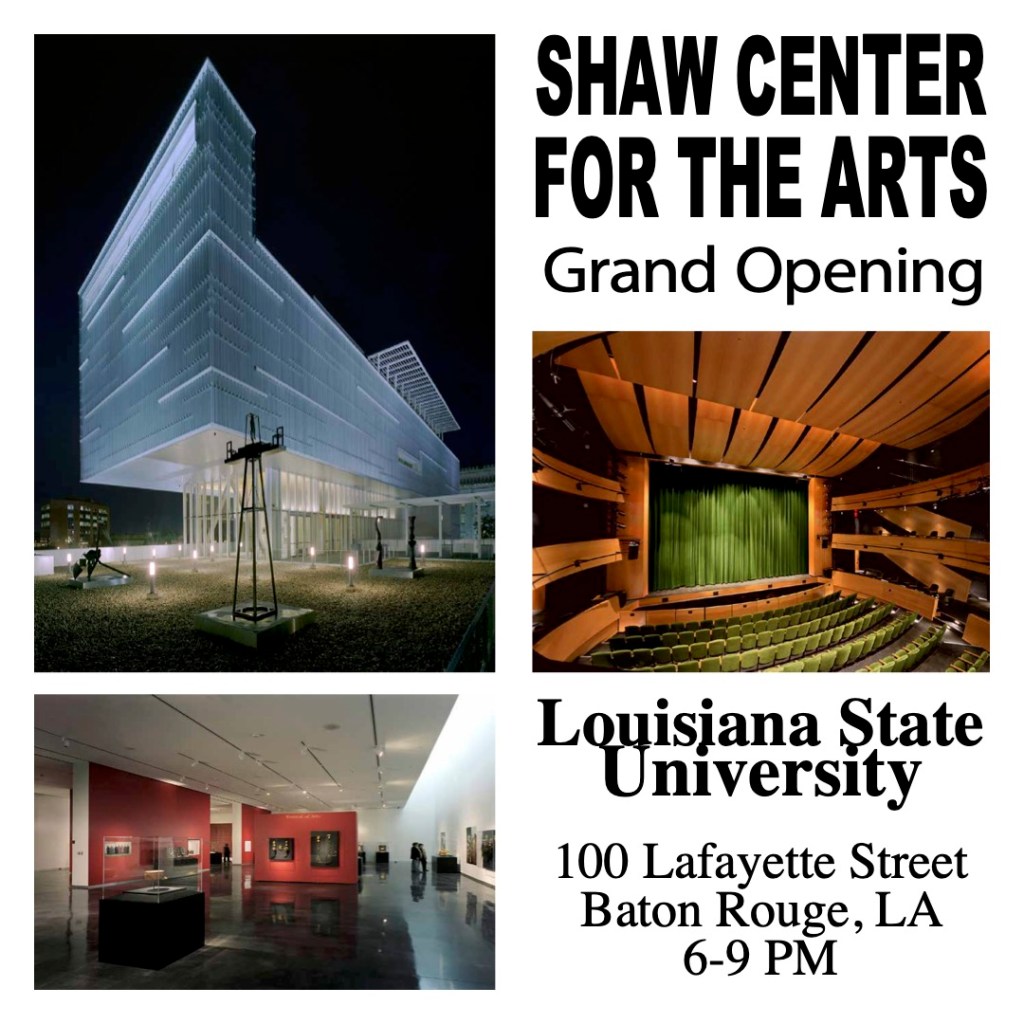
For Instagram, the composition needed to be punchier and more visually immediate. I prioritized bold hierarchy and simplified text blocks so that the core details (Grand Opening, Shaw Center for the Arts, location, and time) remain readable even on a small phone screen. The goal was to let scale and contrast do the heavy lifting, in fewer words, larger type, and a centered structure that matches common Instagram viewing behavior.
Social Media Caption
The Shaw Center for the Arts officially opens its doors! Experience world-class art, performance, and design at LSU’s newest cultural landmark. Join us Sat., Apr. 27, 2023 | 100 Lafayette Street | 6–9 PM
I chose this caption because it is clear, celebratory, and action-oriented, immediately signaling the significance of the Shaw Center for the Arts’ grand opening. I positioned the Shaw as LSU’s newest cultural landmark, and included the date, location, and time in a clean, scannable format. This makes it easy for viewers to quickly understand the event details (and take action).
How I Built It (Adobe InDesign)
To keep all four assets consistent, I designed them as one “visual system” in Adobe InDesign. I used guides to divide each page into repeatable zones (headline, body, supporting info) and relied on the Align panel to keep spacing and placement consistent instead of eyeballing. For typography, I created a shared set of Paragraph Styles and Character Styles for headings, subheads, body text, and emphasis.
As I built each asset, I repeated the same alignment points, spacing rules, and overall composition so the campaign maintained unity, repetition, and strong visual rhythm even when the formats changed. Before exporting, I compared all four pieces side-by-side to confirm consistency in hierarchy and layout, then exported production-ready files (PDF).
This project pushed me to think like a designer building a campaign rather than a single artifact. By focusing on hierarchy, repetition, alignment, and platform-aware readability, I created a coordinated set of assets that promotes the Shaw Center’s grand opening across print and social without losing clarity or consistency. Even in draft form, the system demonstrates how one visual strategy can adapt to different audiences and constraints while staying respectful, accessible, and easy to understand.

Leave a comment